FORGE
A grid so disciplined the work sits inside it without decoration.
- Strategy, UX / UI, Web Design, Development
- Minimal · Architectural · Bold · Grid-driven · Editorial
- Numbers are set in mono so specs read like a drawing label.
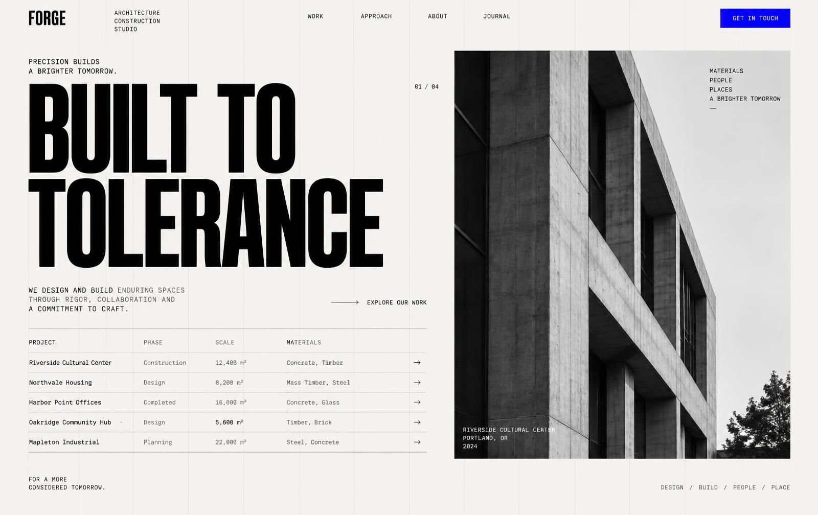
A fictional architecture and construction studio that needed a digital presence communicating precision and craftsmanship. The concept treats the website as a drawing set.
The idea
Construction sites sell trust through evidence: plans, sequences, tolerances. The concept puts that evidence on screen — projects presented as sheets with phase, scale, and materials labelled.
The approach
One 12-column rule visible throughout. Nothing breaks the grid except the project imagery, which spans it edge to edge so the contrast reads as intent rather than accident.
Design direction
Paper ground, structural rules, a single blue used only for interactive states. Metadata lives in monospace; headlines are condensed and uppercase.
bg
#f4f4f1
surface
#ffffff
text
#111213
muted
#6d6f70
accent
#2f4fd8
- Condensed grotesk, uppercase, tight tracking
- Monospace metadata paired with a neutral sans
Interaction
The project index behaves like a filterable drawing register. Hovering a row previews the project in the right column without a page change; opening it keeps the same grid so the transition feels continuous.
How it's built
Index and detail share one layout primitive, so navigating between them animates position instead of re-rendering. Filtering is URL-driven and works without JavaScript enabled.
- Filterable project register with inline preview
- Sheet-style detail header with phase and scale
- Sticky column rules and section markers
- Materials and spec tables in monospace
- URL-driven filtering, shareable and crawlable
- Shared layout primitive between index and detail
- Tabular figures for spec tables