NOIR
A hotel site that behaves like a night walk through the building.
- Art Direction, UX / UI, Web Design, Development
- Dark · Cinematic · Luxurious · Editorial · Atmospheric
- Two weights only. Size does the shouting.
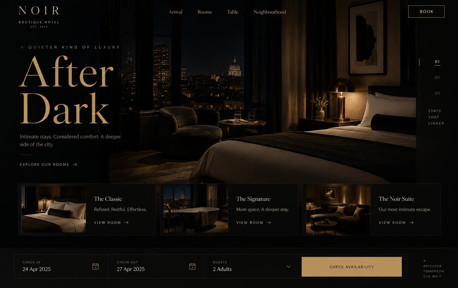
A fictional boutique hotel brand built around architecture, atmosphere, and slow travel. The concept explores how a hospitality site can sell a feeling before it sells a room.
The idea
Most hotel websites open with a booking widget and a stock lobby photo. This concept opens with the room in near-darkness and lets the visitor walk in. Booking stays one tap away, but it never leads the story.
The approach
Structure the site as chapters — Arrival, Rooms, Table, Neighbourhood — instead of a conventional menu. Each chapter holds one idea and one image, so the pacing feels edited rather than assembled.
Design direction
Near-black ground, warm brass accent, and a single serif carrying every headline. Images are cropped hard and masked on reveal so the composition feels photographed rather than placed.
bg
#0b0b0d
surface
#16161a
text
#f2efe9
muted
#8e8a82
accent
#c8a96a
- High-contrast serif display, tight leading
- Neutral grotesk at generous line-height
Interaction
Scroll drives slow horizontal drift on the room gallery. Hover lifts a room card and exposes rate and availability metadata. The booking bar docks to the bottom edge once the visitor passes the first chapter.
How it's built
Static-first routing with image-heavy pages lazy-loaded per chapter, responsive art direction using different crops per breakpoint, and reduced-motion fallbacks that replace drift with a simple fade.
- Docked booking bar with date and guest steppers
- Room cards with rate, size, and view metadata
- Chapter navigation with scroll progress
- Full-bleed gallery with masked reveals
- Art-directed responsive images, separate crops per breakpoint
- Chapter-level code splitting to keep the first screen light
- Motion gated behind prefers-reduced-motion